The way most people do web navigation is totally wrong. They organize their content by the type of media—wrong. They use drop-downs under each primary category—wrong. They carry over long menus onto mobile devices with small screens—wrong.
How do you avoid all this wrongness? Continue reading this post.
On Episode 8 of our podcast, we talked about the following best practices in website navigation:
- Be descriptive. Don’t use abstract menu titles like “products” or “services.” Instead, use specific product categories like “compasses” or “maps” and specific services categories like “custom cartography” both to spell out what your website is about for users and for search engines that are looking for specific keywords and key phrases.
- Avoid format-based navigation. Our think tank clients do this too much. No one is looking for a white paper or a “legislative action plan,” they’re looking for information on a particular topic. Your navigation should focus on the subject matter and guide the user to your most easy-to-understand content on that subject first, giving the option to dive deeper only if they want to. Don’t serve up the 50-page essay first, serve them the 30-second clip of the 60-minute panel discussion about the 50-page essay instead.
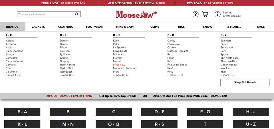
- Avoid drop-down menus. But how can anyone get anywhere without seeing the 12 subcategories we have under “research areas” or “programs” without a drop-down? Either include those subcategories on the “research areas” or “programs” page, or embrace the one acceptable form of drop-down, the mega menu. These menus lay bear the entire navigation of your site, or a whole section of your site, with one mouse-over. Users like them because they make drilling down to exactly what they want fast. We’re not just asserting this stuff, it’s born out by usability studies. Here’s an example of a mega menu from Moosejaw, a clothing and camping gear company:

- Use human psychology to your advantage. We tend to remember the first thing we see/hear/read and the last thing. These are called the “primacy effect” and “recency bias,” or so we’re told by people who right “turns out” type of articles on user behavior. Comedians have been taking advantage of this for decades, planning out their sets with their best joke last and their second-best joke first, leaving the audience with a positive impression as they’ll forget most of the material between those bookends. Do the same with your menus. Your most important offering should be in that top or left position, while the second-most important should be in the bottom or right position. An example might be “research areas” in the first position while “make a donation” sits at the end of the menu.
- Always. Be. Optimizing. Remove items that rarely get clicked if they aren’t critical. Rename or relabel things that rarely get clicked if you think they’re important enough to keep around. Move items that get clicked often high up in the menu order. The most important thing is to actually measure this behavior and react to it. Most website owners/managers aren’t doing that at all.
- For the love of all that’s holy, pay attention to mobile. Don’t be a basic b*tch living like it’s still 2008 and fail to plan for mobile. Letting your CMS stick in a hamburger menu—those three horizontal lines that are supposed to mean something on their own—is really failing your users.

Throw them a line and put the word “Menu” or “Topics” or “Policy Research” or something relevant next to that icon so their brains have something familiar to latch onto and guide them to the next action. Also, edit your mobile menus down to what is used on mobile. If your users aren’t visiting certain areas of your website on mobile, or are using them less frequently, don’t include them in the handful of links you stack into that menu.
All of this can be summed up by saying “put the user first.” Don’t try to push some pet project on users through your menu—user your blog, social posts, podcast, videos, and email for that. Don’t try to make your menu clever—be clever in your writing or over cocktails but make menus literal, boring, direct, and stupidly obvious. Use your website on a bunch of devices and try to get to a specific category of content using only the menus. Note when your hand tenses up and your heart wells with rage, that’s a little voice inside you telling you that your menus are awful. Fix them post-haste.
All of this should result in more time on site, more clicks per session, and more users hitting the goals you have for them, like downloading your research, buying a product, or signing up for your lists. All good things.


