

What is a “center” at a think tank?
- Is it an administrative distinction?
- Is it a way of packaging research for fundraising?
- Is it a way of highlighting joint research efforts?
The answer to any of these is unclear and think tank websites aren’t making it any clearer.
But the most important question to ask is:
- Are website users helped or hurt by highlighting centers?
For the average user, centers are likely to create confusion when offered as a means of sifting through content or filtering search results.
The Urban Institute
For example, The Urban Institute offers both “Research Areas” and “Policy Centers & Initiatives” as potential search filters.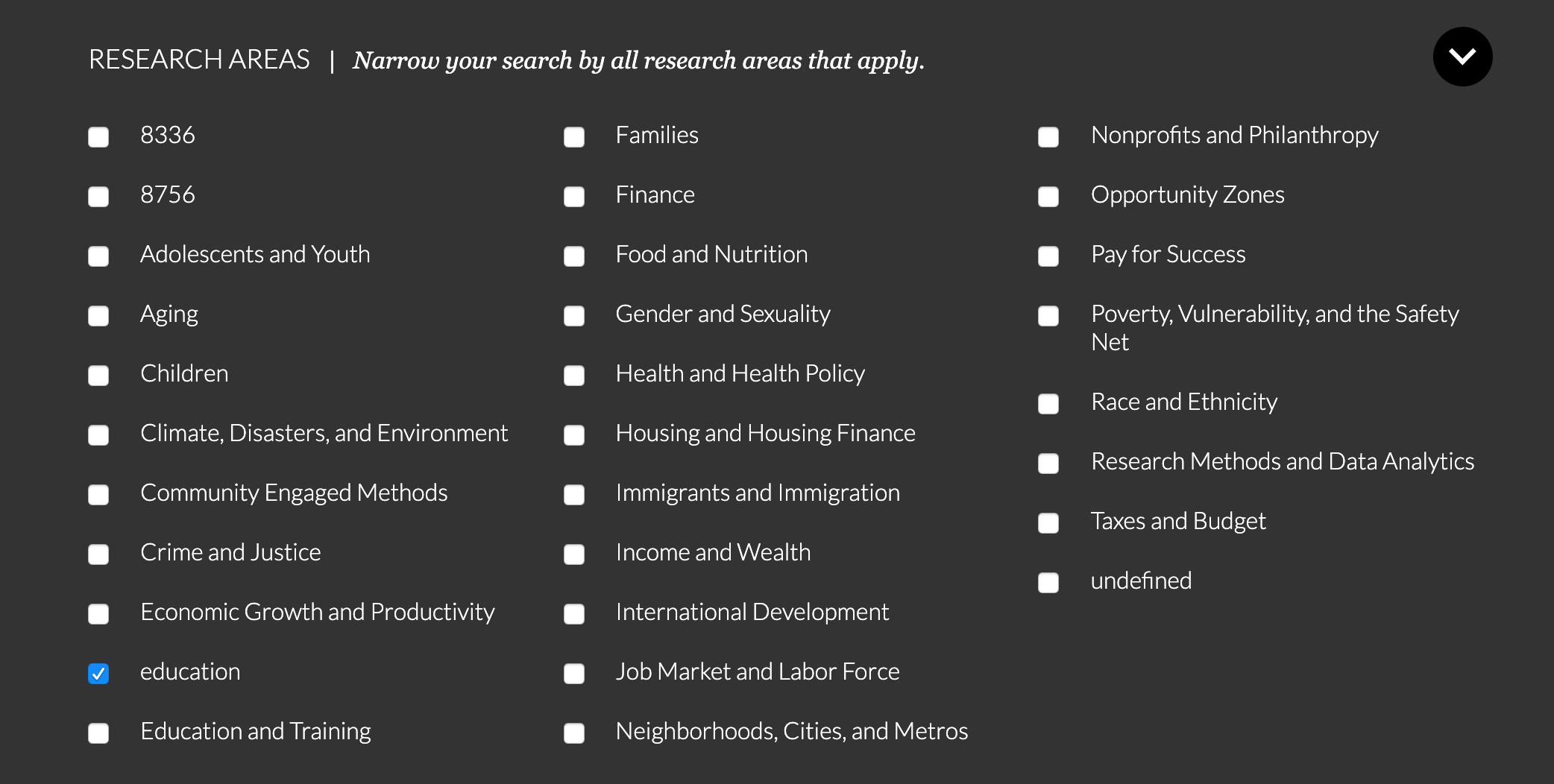
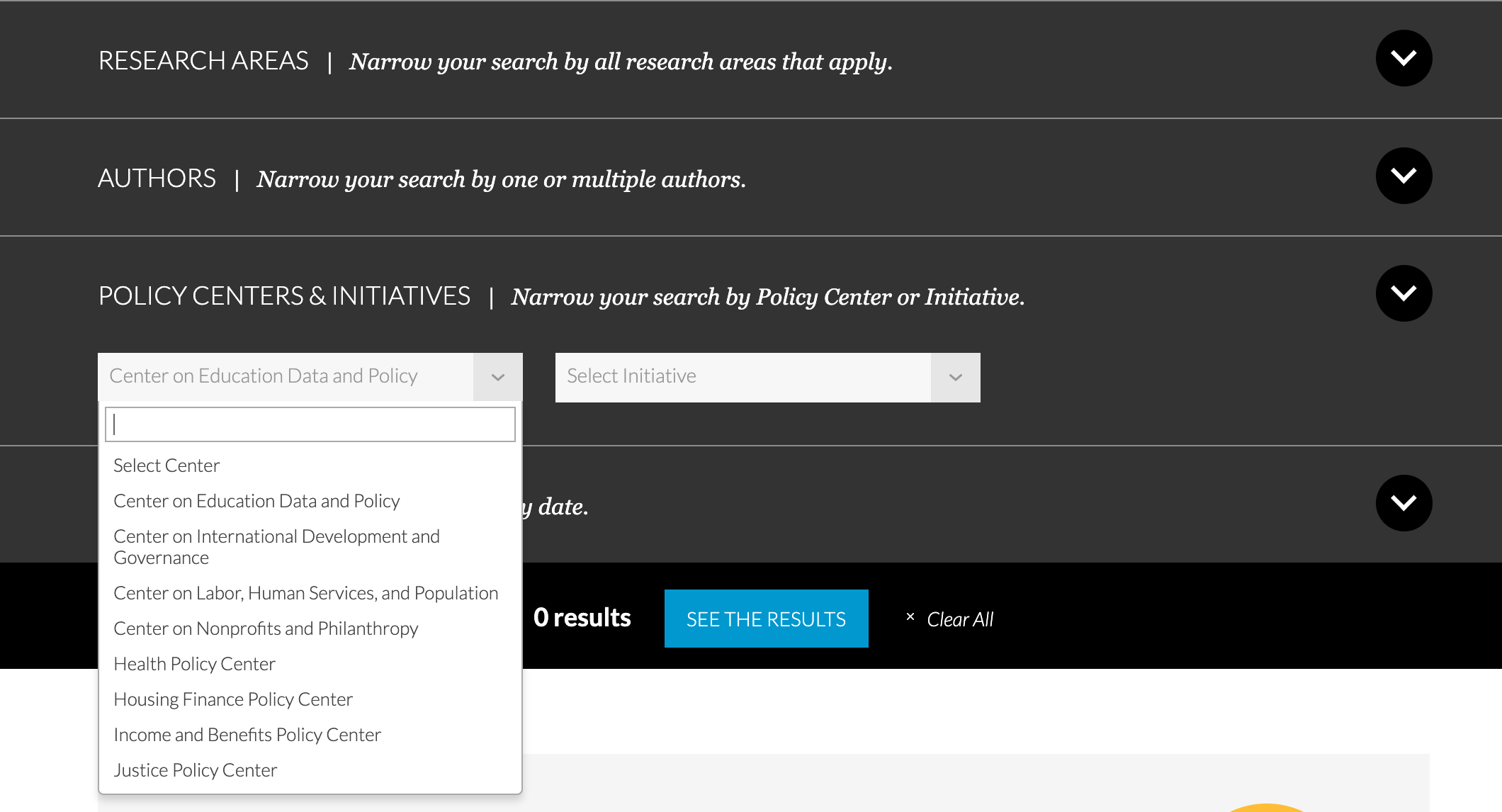
If a user were looking for how Covid-19 is affecting education policy, would they be best off filtering their “Covid-19” research results by using “education” under “Research Areas” or would “Center on Data and Policy” be a better choice?
The only way for the user to know is to guess and check, which is laborious and discouraging.
This is why libraries use the Dewey Decimal System, rather than offering the Huey, Dewey, and Louie decimal systems.

Parallel systems of organization are confusing to users. One system, even an imperfect one, is better than several competing and semi-overlapping systems.
The Hudson Institute
Similarly, The Hudson Institute offers users two ways to drill into their content offerings, “Topics” and “Policy Centers.”
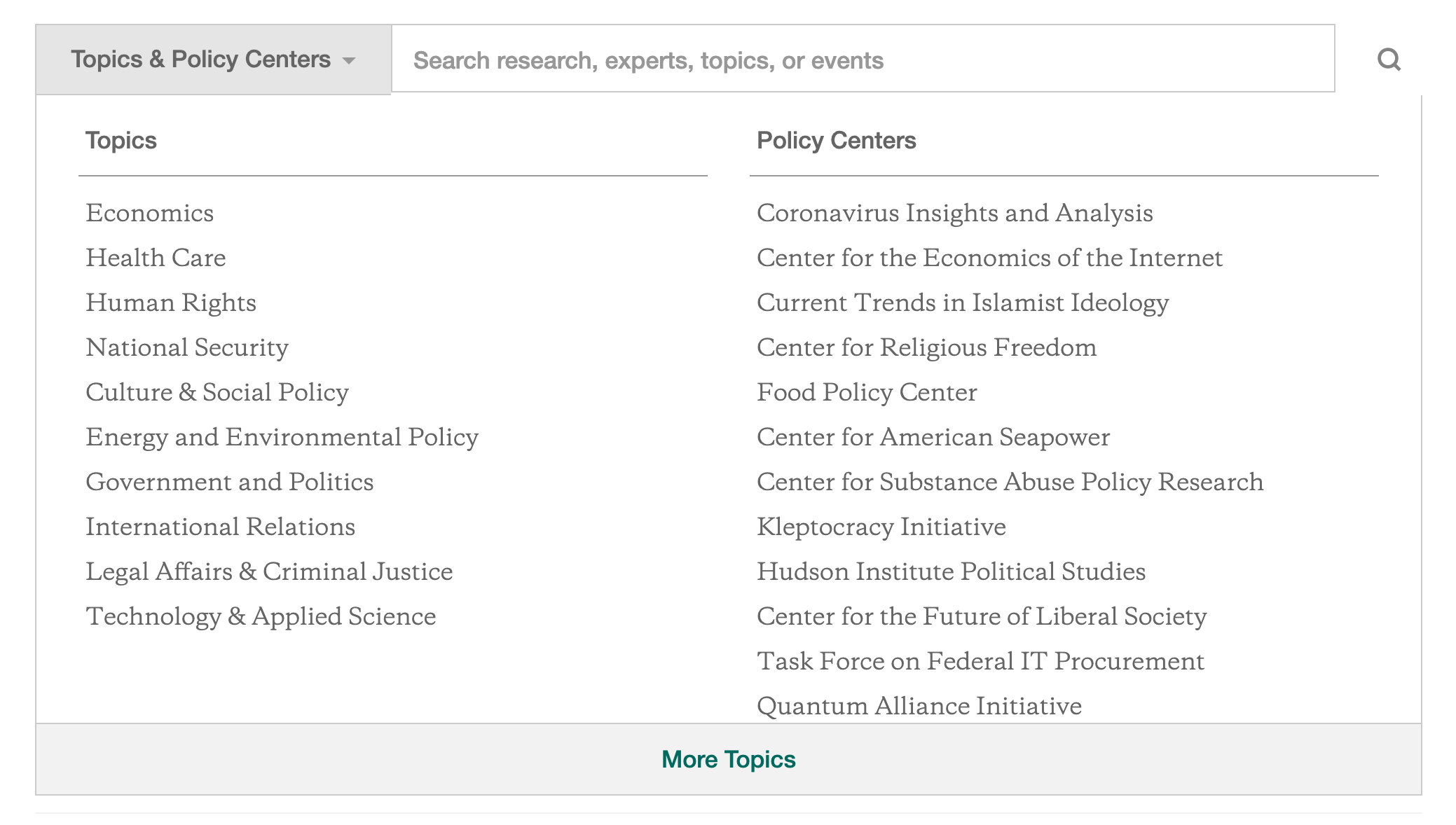
Here, the Policy Centers at least seem more narrow in their focus that the Topics, but again, the average user who isn’t familiar with Hudson’s work and internal organization could be left wondering where to start.
For example, a journalist looking for information about the “Strait of Hormuz” could plausibly look under any of these:
- National Security
- International Relations
- Center for American Seapower
Where to start? Again, it’s time to guess and check.
Brookings
Larger groups with more content, the groups that would most benefit from good sorting mechanisms, seem hellbent on confusing users the most.
Brookings offers dozens of topics listed alphabetically (without making allowances for the word “the”) alongside “Research Programs” that are offered in a three-level organization that takes six flicks of the scroll wheel to make your way through.
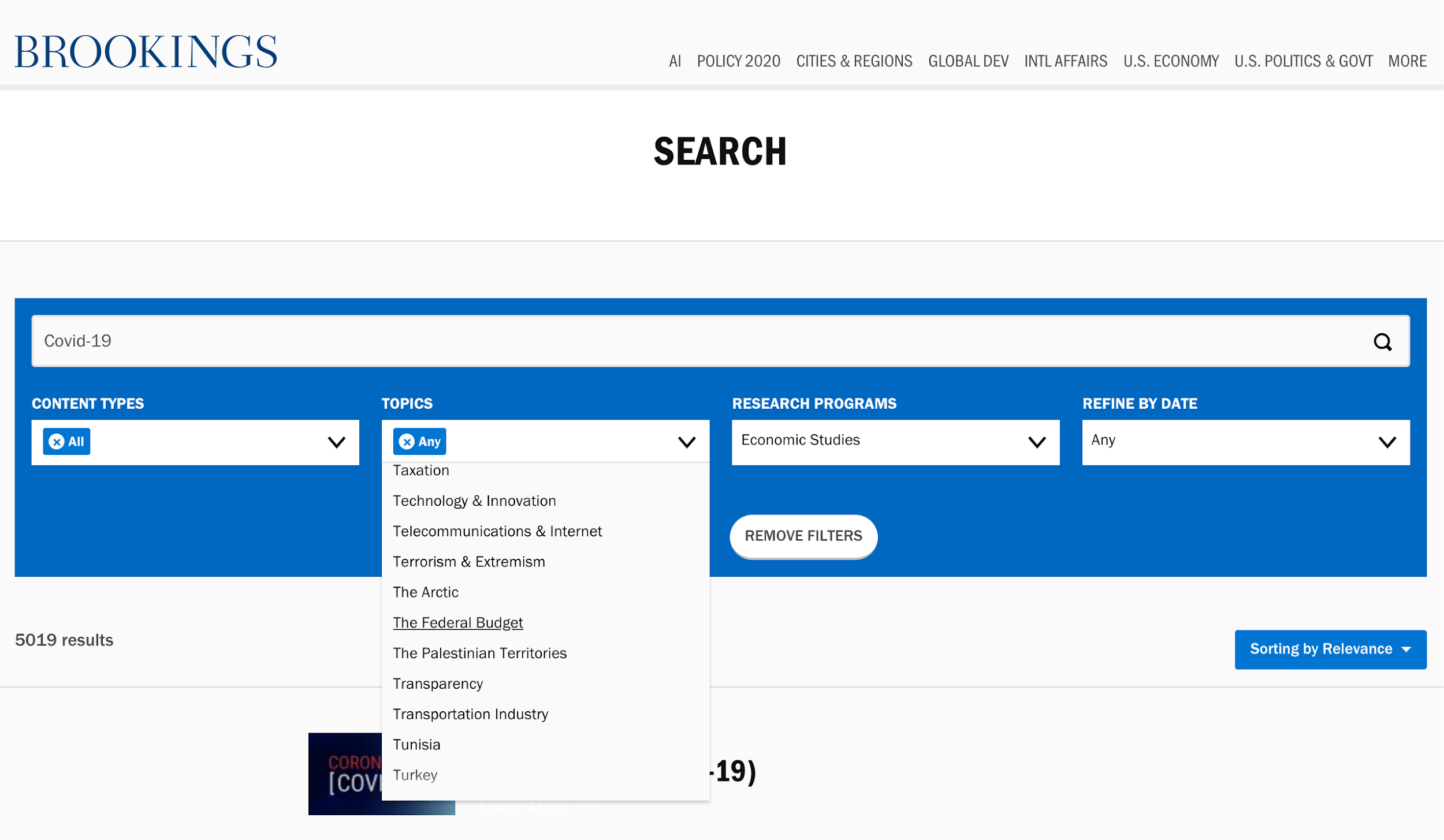
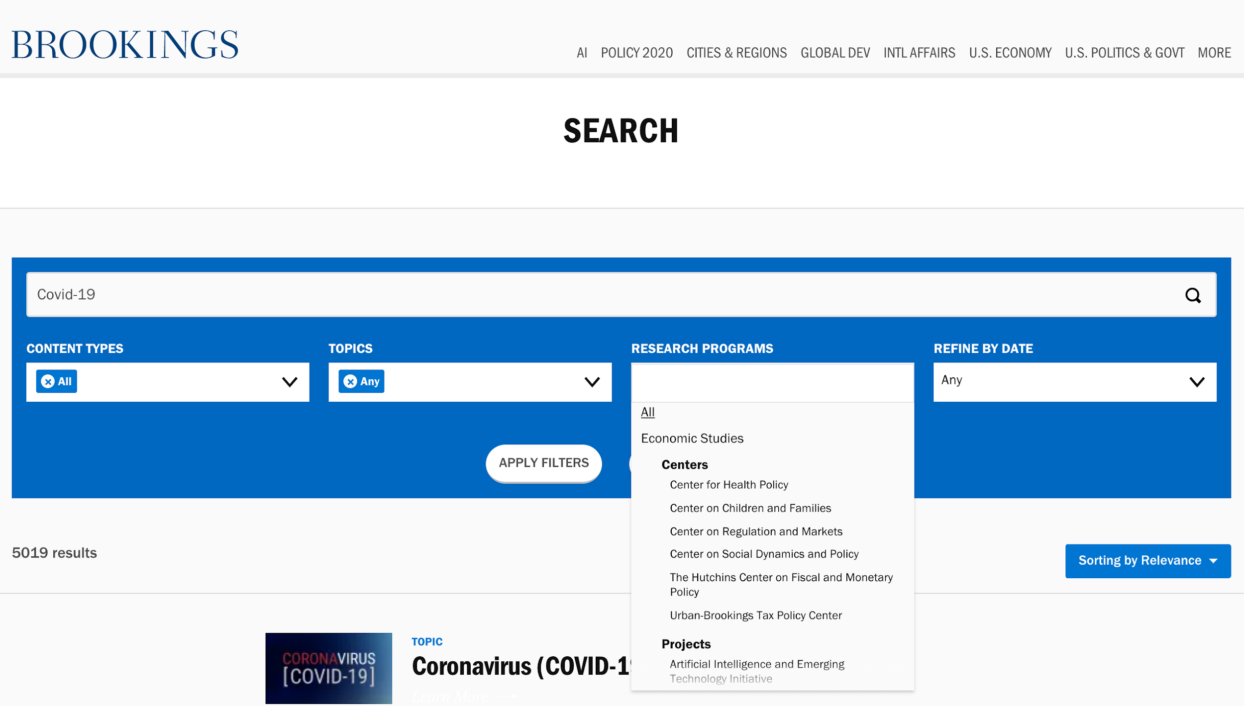
There is no guidance offered to users explaining the difference between these options for narrowing results.
You guessed it! It’s guess and check time.
Pew Research Center
Useful guidance doesn’t mean descriptions of what a research program or center means or does, instead guidance can be offered visually through priority and emphasis, as Pew Research Center does with their search results.
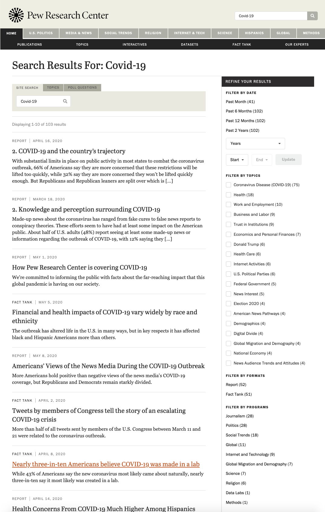
Though Pew does offer users the ability to filter by program, they emphasize “Filter by Topics” by placing it higher in the list of available filters and offering checkboxes as the selection mechanism, causing it to stand out as the primary filter.
These ordering and user interface (UI) choices tell users that “Filter by Date” is the most useful filter and that “Filter by Topic” is probably the next most useful option.
By placing “Filter by Programs” at the bottom of the list of options, Pew’s search UI communicates that programs are not a common option while still making them available for users familiar with Pew’s work.
Rules for Improving Categories
Think tanks who want to keep their category and filtering options understandable to users can follow a few simple guidelines.
Nielsen Norman Group, a globally-recognized leader in user-experience research, says that any set of website categories should be:
- Appropriate: Address the aspects of the content that users find most important, like date and topic.
- Predictable: The categorization offered should be familiar to users, like “education choice” as opposed to “Center for Educational Dynamism and Alternative School Governance.”
- Jargon-Free: This means avoiding the initialisms, acronyms, and high-octane wonk terms that think tankers tend to love.
- Prioritized: The most broad and commonly-used filters should be shown to users first. This might be nesting subcategories within larger categories or initially displaying only the top-ten filters.
To follow these guidelines, Nielsen Norman Group recommends that website owners ask themselves the following questions:
- Which characteristics are most influential to users in making their choice?
- What words do users use to describe these characteristics?
- Do users understand our labels, or do they look like jargon to them?
- Which filter values are the most popular or most commonly used?
The best way to answer these questions is, of course, to talk to actual users! They need to be the ultimate arbiters of how your think tank website looks and how it works.
Unfortunately for many think tanks, department heads and research staff are setting web priorities while actual users are left out of the conversation entirely.
That’s why filters like “The Center for the Analysis of Governance Efficacy and Efficiency” persist when “Accountability” might serve users better.
Quick and Dirty Feedback
A quick method for getting feedback without interviewing users is to set up an experiment using Google Optimize.
You can offer users different versions of your website categorization, search filters, or other elements, and see how different options perform.
For example, offer 50% of users search results with “Topics” as a fully expanded and visible filter list while “Programs” are collapsed by default. Create another search results template that does the reverse for the other 50% of users.
In other words, create a simple A/B test.
Run the experiment for 30 days and see which search results version produces better results in terms of filter user, time on site, dwell time, etc.
We Can Help
If you want to learn more about avoiding this and other usability pitfalls for your think tank’s website, you can call us for a free 20-minute consultation. We can help you identify problem areas and prioritize the fixes that will have the biggest impact for your mission.
Don’t worry, this phone call won’t be “salesy.” Our call will be focused on learning about your goals and the problems you’re facing. That way, we can determine if our approach would be a good fit for your needs.
Book a free 20-minute consultation